How to Make DTF Printed Patterns Brighter? Say Goodbye to Dull Designs
- 6 3 月, 2025
- FERONIAYANG
- 11:42 上午
Creating bright and vibrant DTF prints is essential whether you’re new to the process or have years of experience. Achieving eye-catching results depends on several factors—from the type of film and quality of ink to the precise control of heat, pressure, and even the choice of substrate. In this article, we’ll explore why your DTF prints might appear lackluster and share practical methods to enhance their brilliance.
Catalog
Why Are My DTF Prints Not As Bright As Expected?
If your prints aren’t achieving that dazzling look, consider these key aspects:
- Film Quality: The film used in the printing process plays a major role. High-grade films with a bright, white base can reflect light more effectively, making your printed colors pop.
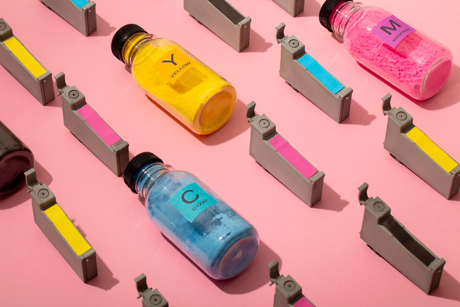
- Ink Formulation: Only top-quality inks designed specifically for DTF printing can deliver intense, vivid hues. Lower-grade inks may result in faded or muted colors.
- Heat & Pressure Settings: Both under- and over-application of heat and pressure can alter how the ink bonds with the substrate. Insufficient settings might leave the ink unactivated, while excessive settings can cause the ink to bleed and darken.
- Substrate Characteristics: The type and condition of the substrate (garment or material) affect the final look. For instance, darker or multi-colored substrates might require an extra layer of white ink to serve as a vibrant canvas.
- Image Resolution: The original design should be at least 300 DPI. Low-resolution files can lose detail and brightness, while extremely high-resolution images might unnecessarily extend print times.

Strategies to Enhance DTF Print Brilliance
Here are several methods to help you achieve the most vivid prints possible:
Invest in Quality Materials:
- Use premium films that feature a bright white background.
- Select inks that are formulated for DTF printing to ensure high color saturation.
Optimize Heat and Pressure Settings:
- Experiment with your printer’s settings. Too little heat or pressure can result in poor ink adhesion, whereas too much may cause the ink to spread or darken.
- Always refer to the manufacturer’s guidelines for the best results.
Prepare Your Substrate Properly:
- Clean and dry the printing surface thoroughly.
- If needed, apply a high-quality primer to eliminate any impurities that might interfere with ink adhesion.
Utilize White Ink as a Base Layer:
- When printing on dark or colored substrates, start with a base layer of white ink. This serves as a foundation to enhance the vibrancy of subsequently applied colors.
Apply Multiple Ink Layers:
- Consider printing in layers. Allow the first layer to dry before applying additional coats. Multiple layers can boost brightness and depth, ensuring a more dynamic final print.
Additional Tips for Perfecting Your Prints
Adjust Ink Density:
Tweak the ink density settings to control the saturation. Increasing the density can intensify colors, while reducing it might produce a more subtle effect. Always test your settings on a small scale before committing to large runs.Control Your Environment:
Maintain a stable temperature in your printing area. Fluctuations can change the viscosity and adhesion properties of your inks. Additionally, keep the workspace free from dust and debris for clearer, sharper results.Consider Spot Colors:
For designs that rely on specific hues, using pre-mixed spot colors can yield brighter and more consistent results compared to the standard CMYK process.Calibrate and Verify Artwork:
Ensure your design files are in CMYK mode and set to a minimum resolution of 300 DPI. Regularly calibrate your printer and monitor to maintain accurate color reproduction.
Practical Application Example
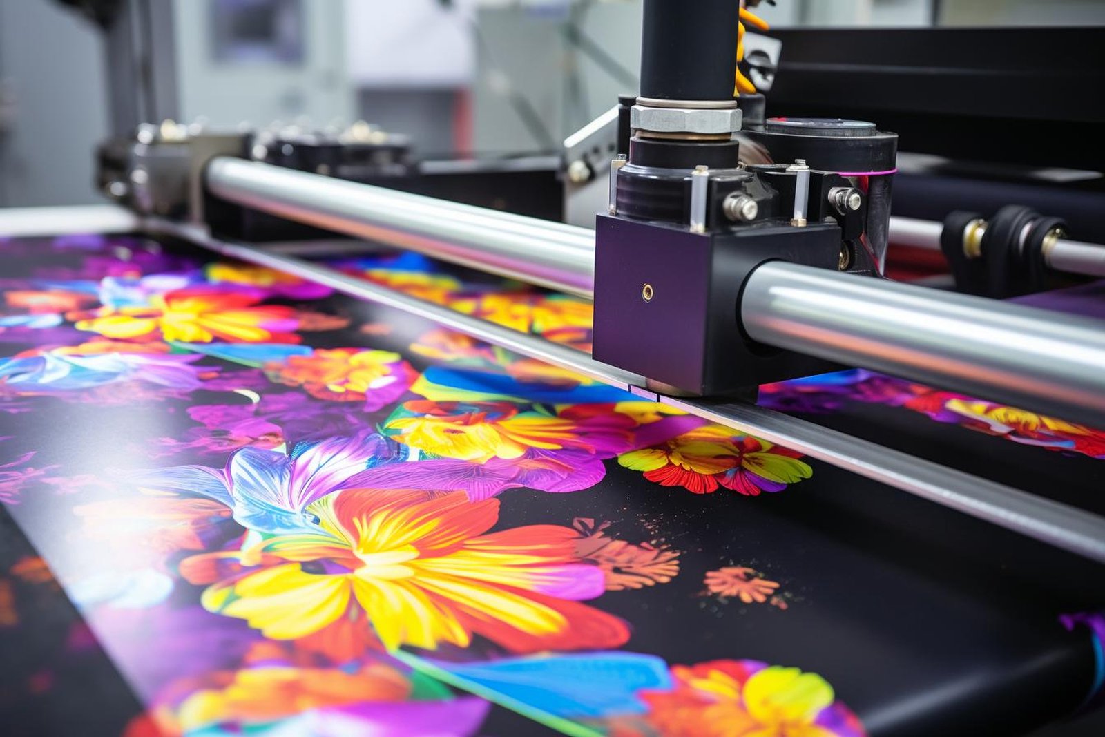
Imagine printing a design featuring bold yellow and pink on a dark T-shirt. The dark base might subdue the brightness of the colors. However, if the same design is printed on a light-colored garment with a proper white base layer, the colors will stand out more dramatically. Selecting the right garment can make a significant difference in the final appearance of your DTF print.
Basic DTF Color Settings
To further enhance print quality, consider these basic color settings:
Color Mode:
Design your artwork in CMYK mode for more accurate color matching.Color Profiles:
Use recommended color profiles that match your specific printer and ink combinations. Consult your printer manual or ink supplier for guidance.Ink Density and Resolution:
Adjust the ink density to find the right balance between brightness and clarity. Increasing the resolution improves detail but may increase print time.Color Calibration:
Regular calibration of both printer and monitor is key to ensuring that the colors remain consistent and true to your design.

Troubleshooting Common DTF Print Issues
Even with careful planning, issues may still arise. Here are some common problems and solutions:
Fading Prints:
Insufficient heat or pressure may cause prints to appear faded. Try incrementally increasing these settings and run test prints.Inconsistent Colors:
Check for issues such as paper jams or inadequate ink supply. Clean the printhead and verify that your DTF inks are compatible with your printer and film.Ink Bleeding:
Excessive heat, pressure, or incompatible ink formulations can lead to bleeding. Experiment with lowering the settings or adjusting the process to maintain clean edges.Poor Ink Adhesion:
Inadequate substrate preparation or low heat and pressure settings may cause poor adhesion. Ensure that the substrate is clean and that settings are optimized to match your materials.

By fine-tuning these variables and addressing common issues, you can master the art of DTF printing and produce bright, vibrant patterns that truly stand out. Happy printing!
For more details on specific models or industry case studies, feel free to consult us for additional product information and reports.